Training Zone Targets (COMPLETED)

I had a user email me yesterday and another one email me today asking for Zone targets. I also know we have other requests similar to this in the forum but I am creating this one to be specific.

I did not get full clarification but I think something like this is what they would like.

What does “.6” mean?

Great question. I was confused first seeing this too but the other user emailed this idea and I kind of liked it but it might be too confusing. .5 would be the middle of Z2 and .1 the lower end. Just to give you an idea of where the actual target is. Maybe it should just be Z2 to save confusion :slight_smile:

Maybe Z2, Z2+ and Z2- would be enough and clearer because upper Z2 is pretty different than lower z2. So following original workouts would be closer by splitting zones into 3 parts.

Some requests for this feature are likely to come from cyclists using our training method. In our video lessons, the power data is displayed as a percentage of the user’s FTP and not in Watts, the Power Zone are displayed with a decimal value.
In this way, whatever the performance level of the individual cyclist is, the achievement of a certain expressed Power and relative Power Zone/Target is parameterized to his FTP.
Splitting zones into 3 parts it might be a good solution for our users.

This zone “divider” is getting used in quite some other tools. The CIQ datafield “In The Zone” for Garmin is one example where a colored bar (in the specific zone color) fills farther as you get higher in that zone.
I like this, because it gives you an idea where you are in that zone at a glance. The colored bar being my preference but function-wise the same as the .6 digit.

We have this feature now but maybe it is too hidden from users. They must tap on watts. See it displayed. But yes maybe it is coming from your users :slight_smile:

Wow, that is an interesting view. I don’t fully understand it but I think I get what you are saying and yes maybe that is a good idea. Would something like this make sense?

Target shows zone you are shooting for, and watts on left shows you where you are in your target zone.

image

4 Likes

What is your feeling about this second colored view I am proposing? Personally it seems like it is nice to see the target watts or target percent as well as the zones (like you suggested or you have).

Yes, seeing all the values together would be perfect, the use of color to show the power zone you are in is a method used by many manufacturers of trainers and spinbikes.

1 Like

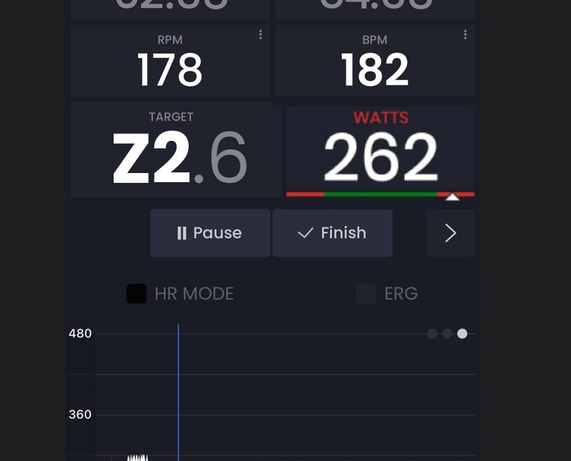
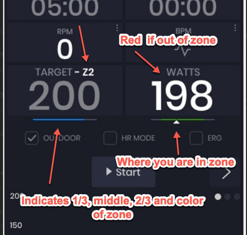
Personally I think this is a bit too “colorfull” :grinning:
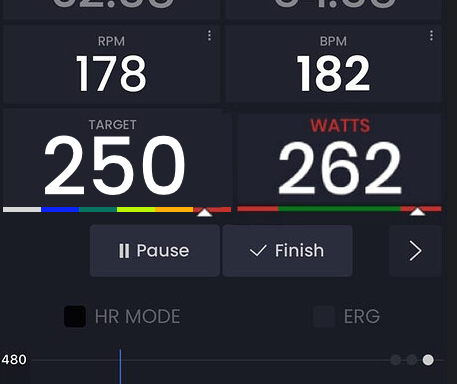
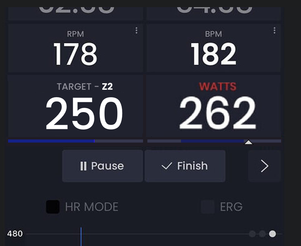
What about a bar in the specific zone color that grows from left to right when further in that zone? See blue bar in this example:

Make sure to use the Garmin std. colors if you go this way, otherwise it would be very confusing. Grey= Recovery, Blue = Endurance, Green = Tempo
Yellow = Treshold, Orange = VO2max, Red = Anaerobic, Purple = Neuromuscular.

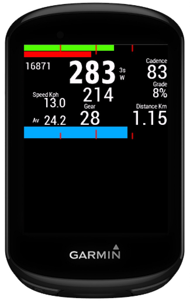
I’m using the CIQ field as my primary dashboard on my Garmin since about 2 years and am very happy with it. It has a lot of information but remains clear and intuitive. Circle Top Left shows 3sec Pwr and cadence as numbers and the circle bar grows with 3sec power. Top right has Normalized Power, intensity Factor and TSS, circle bar follows NP.
Bottom left is HR and altitude, circle = HR. Bottom right is Avg HR and max HR, circle follows avg HR.
Center dial has W’ and the value of W’ automatically updates if you go below 0.
The numbers top to bottom: grade, DI2 info, Time of day, Activity time.
Bottom line left to right: Actual speed, Avg speed, distance covered.
I’m not using the histograms because that’s too much information in my point of view.
Full details and configuration possibilities are here:
https://robayris.github.io/inthezone/home.html#releases

Oh that is a good idea too. I could not agree more with you about too much color… I hate it but I have not had my designer work on this yet. But yes below is much better in my opinion.

Deciding how to implement and integrate this feature is clearly up to Alex and his team of developers. As mentioned, certainly the use of colors for the power zones is more immediate than the numbers. Here is an example that is not from Garmin but from ICG.
The 5color zones

Yes, yes. See above. This is Zone 2 blue but maybe both left and right should be blue.

Like this

2 Likes

Colors seem to correspond. Only zones 5-6-7 from Garmin (actually Cogan) are compressed into one single zone 5 colored red. And that corresponds to the 5 HR zones used by Garmin.
All-in-all I think this collor pattern has been adopted by most other products.

1 Like

Yes I would do 5 also compressing 5-6-7. Agree these are coggan zones.

So here is final design. I decided since this is small enough I am just going to turn it on all the time. Not have a setting to turn it off. Does anyone see a problem with this?

image

2 Likes

I think it looks good.

1 Like

This is out today in version 2.6.2

2 Likes