Visual layout improvements

I am someone who wears glasses, but I can see fairly well without. However, the interface for trainerday means it’s quite hard to see the graph and my current power vs target power. I think the following should be made bigger and some of the other things removed perhaps:

  • Current vs target power
  • Interval time remaining
  • The graph… I think it’s currently animated at about 1 pixel/second which means it’s really hard to see ‘recent’ progress, you can only see after a minute or so if you’ve been on target. If this could just be zoomed in horizontally by maybe 3/4x and scrolled (basically like how trainerroad does it…) that would make a big diff.
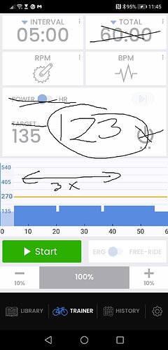
Note that you could save a lot of space just by getting rid of the bottom menu, it’s unlikely mid-workout that you want to go and look at your history for example… This should be hidden during a workout and perhaps come back when you select finish.

Actually I’m using the bottom menu very often during my workouts. Sometimes I don’t have one complete workout, but I’m building my current workout on the fly from different workouts in the library. So I start with one warm-up workout, switch to another workout and switch again. I think this hot-swapping is a great feature of TD and I’d be very unhappy, if this bottom menu would disappear.

1 Like

I actually want to get rid of the bottom menu but still allow hot swap. Ride with GPS does this nicely.

They just show a popup, but it still keeps going even if you close it. This give syou extra space but allows this hotswap.

I guess I was just thinking of ways I would change the GUI for my use case… interesting to hear of how other people use the app. I do think either making the current vs target power bigger or making it possible to re-arrange the screen would help me a lot.

Yes I agree on zoom feature. For now I think the simple solution is making the chart tappable for 3-different zoom levels. 5m, 20m and full workout. As far as font sizes go, I think ours right now are as large or larger than almost everyones on a phone. That said my eyes are similar to your and I would be happier with even bigger.

Yes that is expensive option (user arrangable screens), and I am avoiding expensive solutions but also trying to make it the best possible for as many people as possible and bigger fonts are always welcome. I also want it as clear as possible for the beginner and advanced person so I prefer to state Target to make it extra clear. The zoom feature is the one I can see coming the soonest :slight_smile: Tablet is obviously way to see bigger fonts. If I can switch from bottom tabs to popup that gives us more room for bigger for sure. But that won’t be right away…

When I’m using the workouts of my plan, I don’t need the hot-swap feature. But when I just hop on the bike on the days with no planned workout, I really love this hot-swapping. But maybe it can be done without using so much real-estate on the screen.
And I’m using the app on an 11-inch-iPad where you don’t have the same problems regarding space.

Me too, so happy you agree