I’d like to propose a UI improvement to make the TrainerDay App workout screen more intuitive.
Horizontal Scrolling
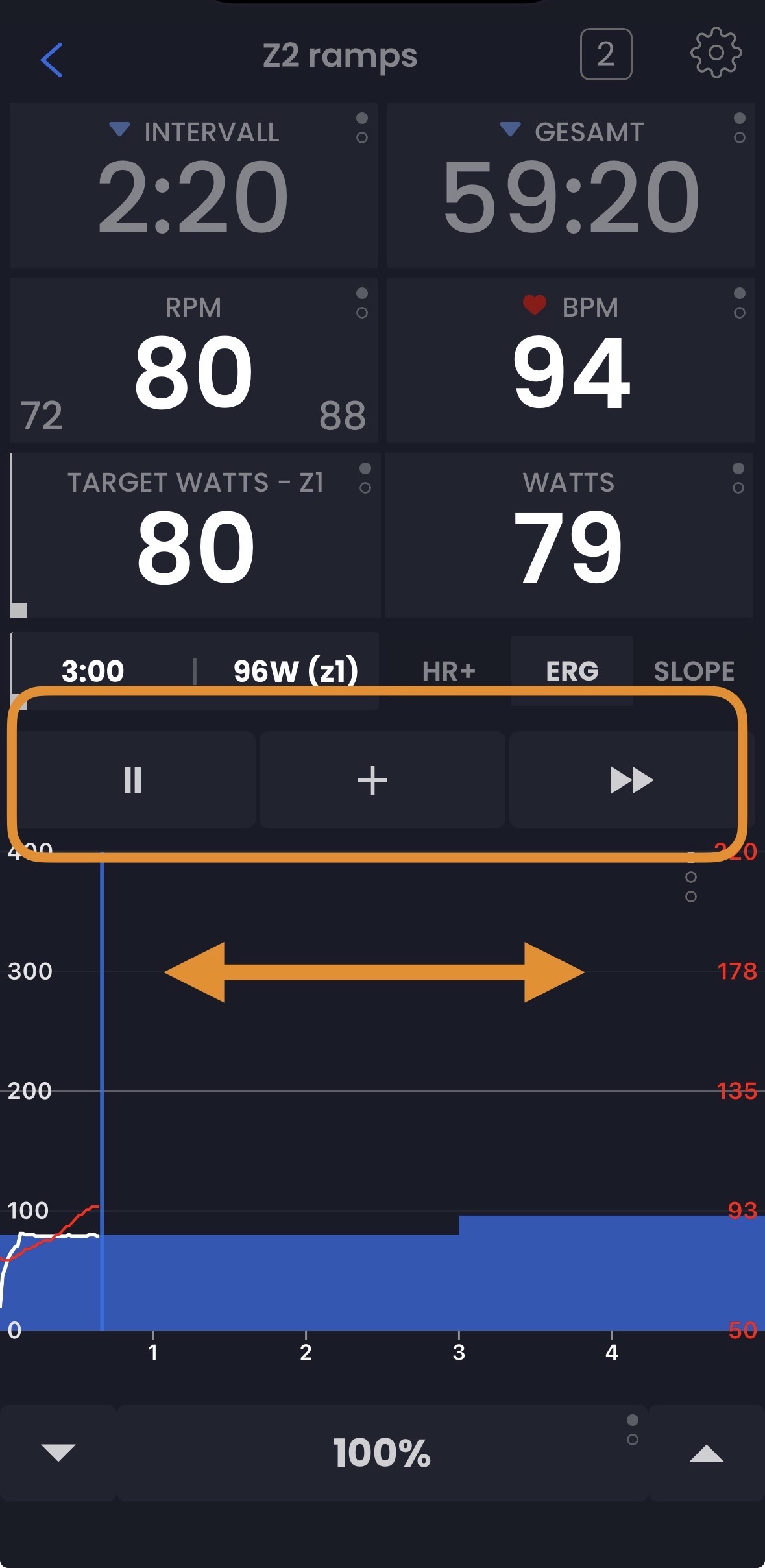
Currently, we tap through zoom levels to see different parts of a workout. I suggest replacing this with a horizontal scroll (swipe). Swiping left or right would allow us to quickly see past or what is coming up next without taps through zoom levels and loose details
UI Layout Changes
To clean up the view, the Zoom Level buttons could be moved up near the Play/Pause controls. This keeps the power graph area dedicated to navigation and viewing.
I believe this would make the app feel more fluid and easier to use. What do you think?
The buttons is especially scary, but both of these tasks are very scary. The code regarding moving that little line forward is kind of scary. It would seem rather easy, but it’s not as easy as it should be. But the buttons barely fit on some devices, so there’s not really room for zooms where those buttons are. I for sure like the scroll idea. It would be very nice. We could try to try it and just see if it’s as scary as it seems. You could always tap to zoom and slide to scroll. We don’t need to move the zoom.
Okay, we’re probably not going to do this right away. But for sure as I start working on it, I’ll ping you here. If I test it and it seems like it’s not going to cause too many headaches, I for sure like the idea.