I would love to see a more prominent visual indicator for the current date in the TrainerDay calendar. This would make it much easier to quickly orient myself when viewing my training schedule.
Suggested Implementations:
Bold Outline: Place a distinct, bold outline around the current date’s box.
Color Highlight: Use a different background color for the current date, perhaps matching TrainerDay’s theme color.
Icon: Add a small, recognizable icon (like a dot or a calendar symbol) next to or within the current date’s box.
Combined Approach: Combine the outline and color highlight, or the outline and icon, for maximum visibility.
Benefits:
Improved User Experience: Faster and easier navigation of the calendar.
Reduced Cognitive Load: Less mental effort required to identify the current date.
Visual Clarity: A cleaner and more organized calendar view.
To be honest, I’m not a product manager or a UX designer, just a software engineer. My suggestion is to have a more prominent visual indicator for the current date in the calendar. This way, when looking at the month overview, it’s immediately clear where we are in the month.
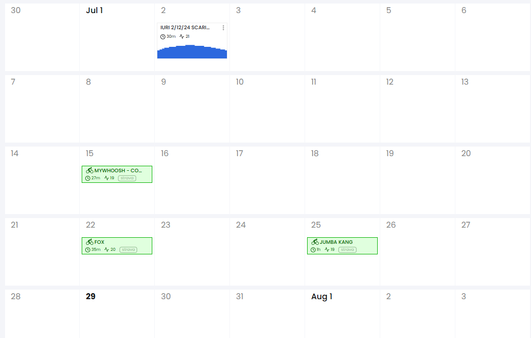
Additionally, I’d suggest displaying the current week in the center of the calendar view, rather than defaulting to a full calendar month. I believe that in most cases, users are looking for a view of what they’ve done recently and what’s coming up soon. A full month view can obscure the past at the beginning of the month and the future at the end of the month.
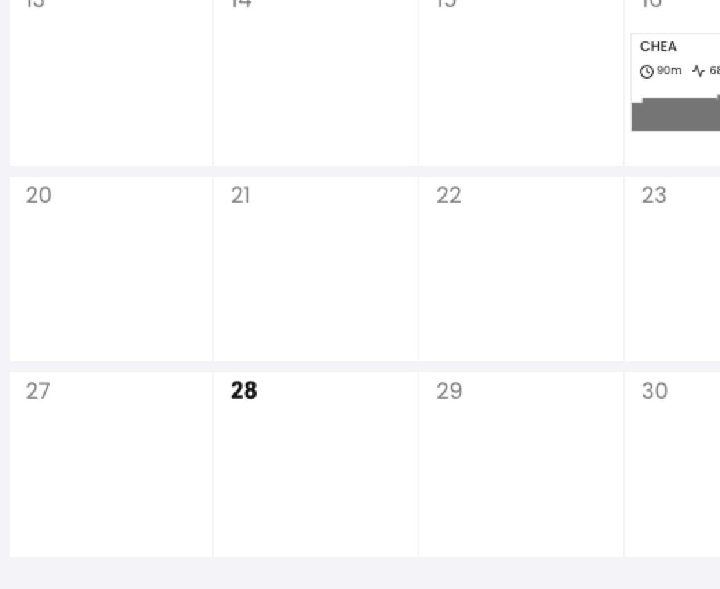
Oh you mean the web calendar, now I understand… Yes, I would like to switch to a infinte scrolling calendar, it’s just more complicated and when were building it the first time we were in a bit of a rush to just get it working, but for sure want to do this. Yes I think when we started this calendar we did not have a designer, now I have a great one so next time we address changes to the calendar we can make today more obvious. Currently it’s just a bold number. 28 today.
It would be great if when we press the TODAY button in the calendar it takes you to TODAY day. Sometimes TODAY is out of the screen and when you press TODAY it never takes you to the TODAY date
You obviously have a lot on your plate. But it would be very useful to have the calendar directly in the app. It could an another premium feature for paid subscribers…
I second this. The other issue is that the first day of the month is also prominent, so there are 3 options when your eye first casts over it for “today”.
 You seem like a good/great product manager or UX designer