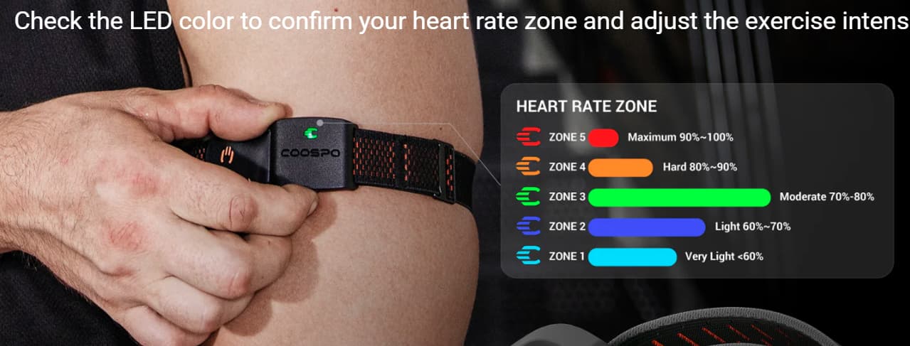
I would like to see my heart rate with color (blue = warm up, green = fat burning, yellow = aerobic, orange = anaerobic, red = extreme) depending on zone I am in. The gauge would also show current percentage of the zone like it is shown on the tiny bar in the power values.
Why? For example when trying to lose weight, it is recommended to train in the 65-75% of HRmax. And where from should we get the current heart zones? Either by calculating them from well-known formula based on gender, weight, age but tha would mean additional data in user profile. Or better, set the zones (HR from A to B = Zone 1, from C to D = Zone 2 and so on) so every one would calculate/set them individually by own favorite calculation method.
I like your picasso, I love HR based training. This is can turn into conversation that gets deep into the weeds of philosophy of training but overall, we have avoided lots of colors and a heavy zone focus for many reasons…
At the minimum this would required configurable zones including support 2 or 3 zone models… but without writing a book here I can’t really explain why this does not fit our current and I assume long term thinking. As a simple example, do you think your body really sees 75% and 76% as something different and even if it did, do you know exactly where that zone line is for you? Its probably more like gradient transitions.
It’s true with HRmax, just like with tarot cards. Every school gives a completely different prediction. That’s why I thought that everyone should be able to define their own zones according to their intuition, the coach’s instructions, or the stars constellation ;).
The point is to quickly check whether you are where you want to be, without calculating.
But even without this option, the app gives me everything I need for training. It’s just the cherry on top.
We have power zones now if you enable them in settings but not user defined. Happy
you are happy. I want to move more in the HR direction but my original attempt failed and made things more confusing. With a smart trainer you can use HR+ and program your own custom HR targets… For HR this makes the most sense to me.
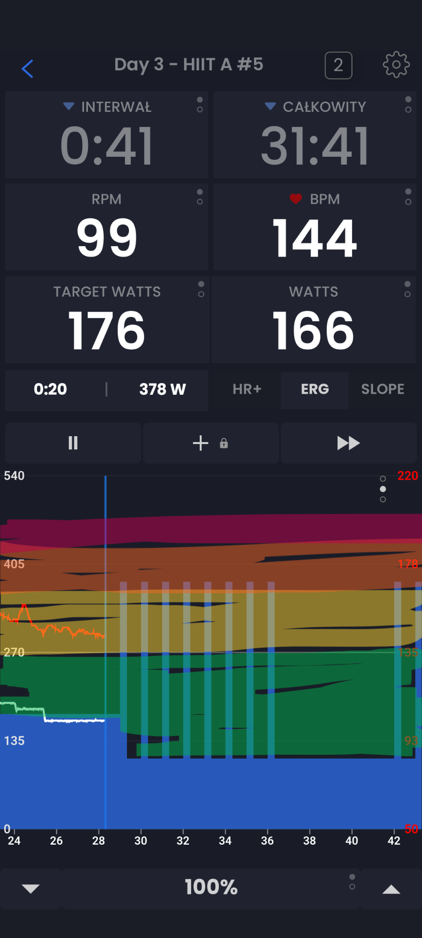
I always thought that you might make better usage of the upper part of the screen where you show metrics; referring to this:
Why not showing the interval averages in the rectangles and eventually color their background (or borders)?
In case of target I would show the % compared to FTP or HR Max
No, no, no you can click the fields to see most of the options you are discussing. Remote buttons would be nice to switch though.
As you know we also have more data on the web ui, with so many devices and screen sizes and user preferences… we have rpm targets in some of those places a million reasons not to do this without bigger budgets…