I’ve just completed my first ride wearing a heart rate monitor. The BPM was actually spot on throughout the ride but that hearf rate red graph was off. At one point the BPM was at about 150 but the chart was showing it just over 100.
It’s as if the heart rate chart isn’t taking account of the scale at the left hand side. It did wonder if that was by design. I am very unfit at the moment as I am recovering from a fractured foot and A bad dose of covid., so my power zones and heart rate graph would fit in with the ftp I’ve got. I did wonder if people with a very high FTP would have issues displaying the heart rate on the graph.
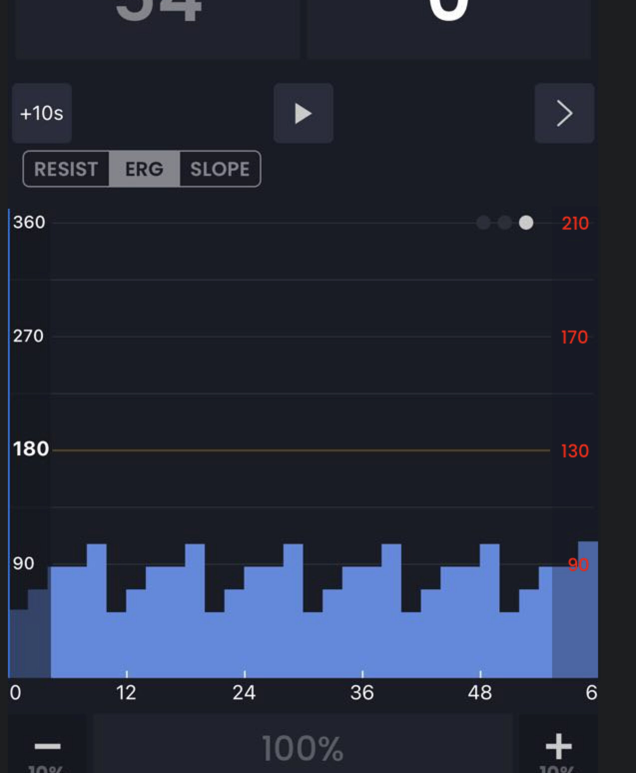
Hi sounds good (mostly) … this HR scale is % of threshold HR rather than HR itself. This is a bit confusing but generally the thinking is HR should be much closer to power and on the same scale with this model so if a person wants to switch to HR focused workout it should be similar to the power based workout. This was designed based on some previous ideas but we need to put more thought into HR based workouts to make it extremely inuitive. Hope that helps.
Oh you mean make something simple and obvious? Why would we want to do that? Why not so cryptic that it takes weeks to figure out out… In the beginning I was fighting this idea. In retrospect I have no idea why.
You mean something like this. Yes you are 100% right probably should that… I feel kind of dumb now having to discuss this.
Hi Alex. Thanks for doing this. It makes hr a lot more understandable.
There is a slight issue. The HR scale is unreadable because you are using red on a black background. The left scale is absolutely fine, I can read that without issue. Please could you change colour or make the text bigger please.
Glad you like it. Let’s leave it like this for a while and see what happens. I think the most important part is current HR (big at the top) and trend lines and you will likely memorize 110 and 165 fairly soon you won’t need to read those. The main problem I saw was it was confusing, but if you and others still feel this way after sometime, I will reconsider. Hopefully that’s ok
 Why not so cryptic that it takes weeks to figure out out… In the beginning I was fighting this idea. In retrospect I have no idea why.