I use TrainerDay on a v1 Kickr Bike, in erg mode, with an iPad as the control device.
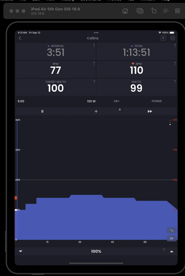
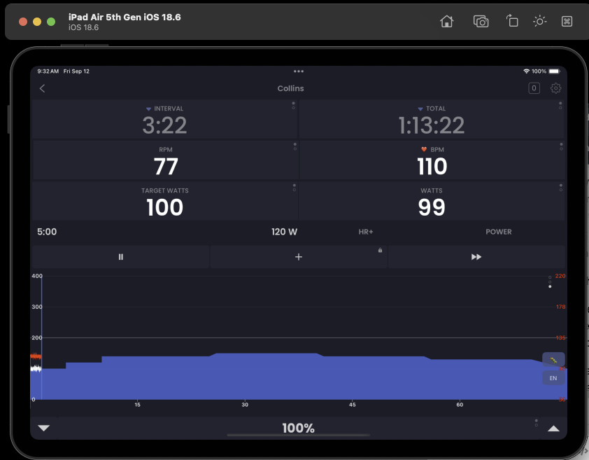
TrainerDay can show 3 times scales on the graph—full workout, minute-by-minute, and in-between. In the in-between time scale, the tick marks alternate between every 2 minutes and every 5 minutes, seemingly at random.
When I hit the button to skip ahead to the next interval, resistance briefly drops to 0. This also happens when I ride past the end of the last interval.
There have been minor margin problems around the graph for the past couple of versions where numbers/text gets chopped off.
When I open Trainer Day on my iPhone, it takes a very long time to show the list of completed activities, and even then, it is not showing the most recent activity. Refreshing that view to show the most recent activity also takes a very long time; drilling into an activity (to share it to HealthFit) also takes a very long time.
Hi Adam, that 2/5 thing I though was a feature Even though it is some random thing the chart decides.
Oh that’s interesting on next. I will work on that.
Please let me know about the margin issues. I thought they were all solved now (except 3 digit RPM on narrow phones) but there are so many different device sizes it’s hard to know them all. Tell your device and I can test it in the emulator
Regarding long time to open activities that’s odd as we just made it much faster and 2 people that previously had issues said it is fast now. You might need re-install to fix this, but we also need to add some form of paging or infinite scroll for people with a very long list and to future proof it. Please let me know if re-install does not fix it.
One person said they really like this 2/5 thing, but I found it a bit strange. I could fix it but waiting for more feedback. Probably for existing users it looks like a bug, but maybe to everyone it looks this way… although the feedback I saw made it seem like people were not sure bug or feature.
I haven’t used the latest update, but using the version I had when I posted my report, the “100%” was getting clipped off, and switching its mode would cause everything to shift up a few pixels.
I think the 2-5-2-5 switch could work if the period was much longer and was consistent. Also, I think if there were a fade between them rather than a sharp jump, it would seem obviously intentional. But I don’t think it’s really useful.
Yeah 5/2 just happened when we changed charting technologies and I did not fix it and then someone said they liked it… so I just waited. I surely don’t want to invest in making it better, much more likely to fix it so it stops doing it. There is no new ios version. I have a new one on my machine but the UI has not changed. Send me screenshot. Maybe it’s some specific setting difference like zoom UI or some default font size or something.
I have not forgot about your issues. Just trying to get all the stuff that seemed to affect a larger number of users. I feel that is all resolved in the version that I currently have. Let me know if you still see any of this in the next version and if you do I will look deeper to see if I can find the source of the problem.
Adam I had your issues in the back of my mind for a long time And as you may have saw had a few other issues to deal with. I believe all your issues should be resolved. If not please let me know.
 button to skip ahead to the next interval, resistance briefly drops to 0. This also happens when I ride past the end of the last interval.