In the workout screen: can the buttons be made a bit larger? While doing a exersize with the TrainerDay on a 6" screen, it is sometimes hard to put the fingers on the right button. It happend that I pressed the forward button instead of erg/slope. Same request for the up and down buttons at the bottom of the screen. I wouldn’t mind if the window with the graph would be a bit less tall.
Ok yes, it’s hard because some devices are small and things barely fit, but for larger devices we could see if we could add a bit more room. Skipping forward is a problem I would love to have a better solution too. People have a drop of sweat click the skip button and that is also a problem.
Suggested solution: is it possible to program in the workout file one or more ‘milestone-like’ time points (there probably is a better name, perhaps FF-point). When pushing the forward button, the workout proceeds to the next FF-point. Would be nice if these time points are visible in the graph and description of the workout.
This makes it possible to skip a part of a workout, like when the interval set is too heavy, or to skip a complete set of intervals.
You mean because now you have to press skip a bunch of times to get past a few intervals? The problem is most people would rarely if ever program this into their workout and you would never know if someone wants to just skip forward to next interval or skip to FF point. I guess we could have a HOLD skip to move it to FF point but again I think it would it would be such a small number of users used this. Maybe if we built it into our CJ plans.
It’s a good idea. I agree with the concept but what I find is lots of my “good ideas” never get used. ![]()
Ok. Get it. BTW. Do you know how many user use a feature?
Many specific features we track yes but not all. I don’t track skip but just from talking to people a lot use it.
A following request/idea about button size. I am using a mobile with 6” screen. And also have issues sometimes with pressing buttons when in the middle of a (heavy) interval. Is it an option to make the control buttons much bigger by removing the graph? 2 options I can thing of:
1. adding another button (in the left middle of the screen?) to show/hide the graph (and with bigger buttons when the graph is hidden).
2. add a second workout screen and switch between screens with the swipe function
Ooh, second workout screen. That’s an interesting idea. With all the different views and all the different dimensions of all the different screen sizes, trying to squeeze anything into the existing screen is difficult. Even hiding the graph scares me. This stuff is all so fragile it’s not even funny. But I’ll think on this. I don’t completely understand what you’re saying the problem is and which button you’re having a hard time pressing. If you’re trying to press the skip button, you have to hold it for a while, but there’s a setting that you can turn off so that you can just click it fairly easily.
The buttons in the bottom corners for increasing / decreasing Percentage or Slope are a bit small when pushing limits on the pedals. Especially when the phone is on the table in front of the bike. I place it a bit away to prevent sweat drops falling on the screen.
The app for the Wahoo kickr had a nice feature: in the bottom of the screen 3 buttons to decrease the power% or slope and 3 to increase, for instance 1%, 5%, 10%. This made manual control very easy.
It looks like they each take about 20% of the ribbon width, with the center portion taking the lion’s share. IMHO the center portion could take less width allowing more to the two ends. When toggling the ribbon to show KPH : KM : CAL, they each take a third of the width.
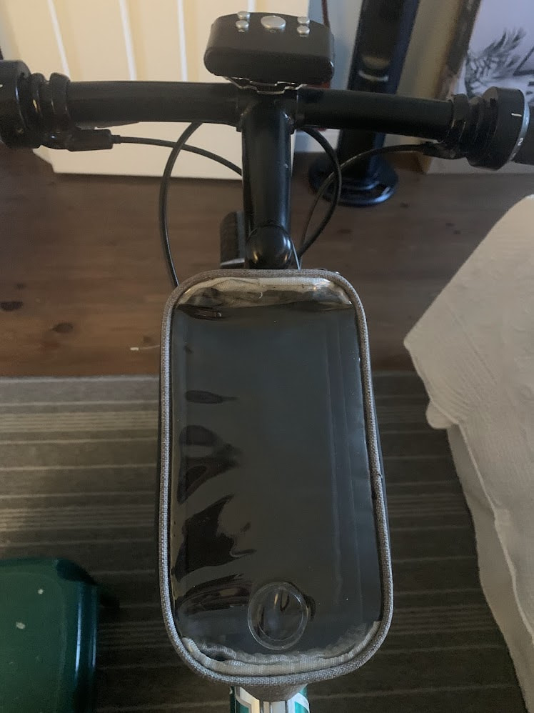
I have my iPhone in a waterproof top tube case so it is impervious to sweat. Not that I work up a sweat, (not yet anyway). I have a fan blowing on my face to keep it dry.
The remote for the fan is on the stem.
1 Like