Hi Alex, I really appreciate the efforts being made toward continuous development of the app, but I’m not comfortable with the layout in the latest version.
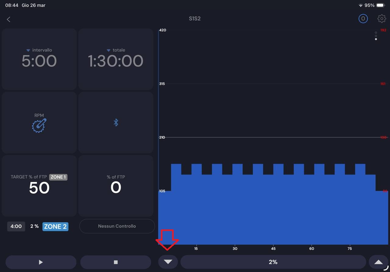
I’m referring to the landscape view on the iPad; I find it difficult to reach the “decrease” button, which is now in the center of the screen instead of on the left edge.
I think the old horizontally split version of the screen was perfect.
Another small note is that I miss the %FTP in the “next segment” pane.
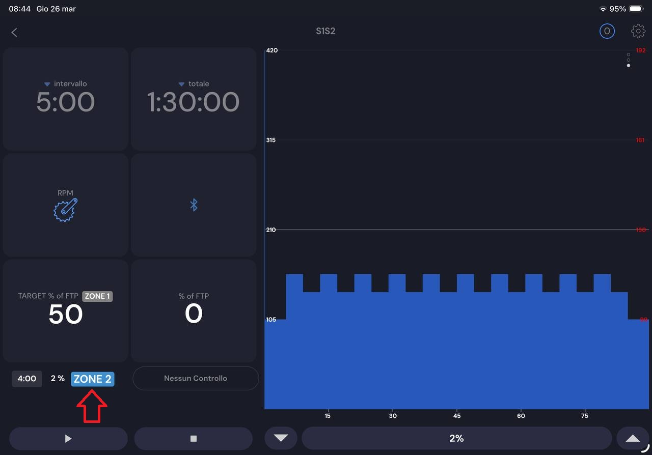
Interesting. You are the 3rd person saying this about preferring the portrait view in landscape, in the past people asked for the opposite and some tablets it was already this side by side way. Yes zone 2 full “zone” word was a bug. I will check on why FTP% is missing and consider going back to top/bottom view.
Thanks for the constructive feedback. I really appreciate it. This button click problem in center vs side is interesting. I really like people doing dynamic training so I want to encourage that as much as possilble.