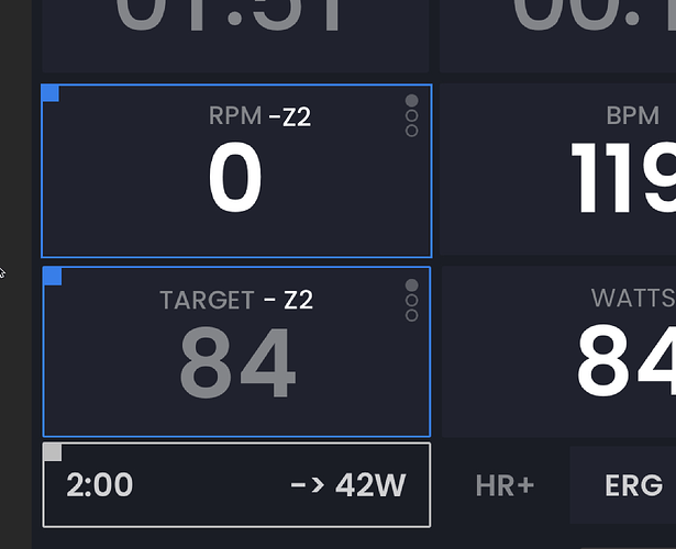
Hi, i’d like to know if it’s possible to see near the number of bpm the corresponding HR zone (like i see in the watt target - number of watts and zone)
We are going to improve our current zones (they are confusing even for me)  and at that time yes we could do HR zones too. Great idea, not sure why I did not think about it
I was wondering if it was possible to add coloured HR zone indicator similar to those that are already there for power? Preferably with a configuration setting to set own HR zones, since there are a few different approaches.
Oh yes, someone asked for it before. I forgot about this request. Never got back to requests from 2 years ago. We have a huge amount going on right now so I don’t see it soon, but yes, I am a fan of HR training and this makes sense, even more now that we have this nice HR+ mode.
Thanks, eagerly awaiting the new feature then ![]() I’m a fan of power-based ERG workouts, but I judge my FTP based on zones correlation instead of FTP tests, so it would be very useful to see both zones.
I’m a fan of power-based ERG workouts, but I judge my FTP based on zones correlation instead of FTP tests, so it would be very useful to see both zones.
Yes, I rarely take FTP tests too and just kind of triangulate them ![]()
Oh but I just realized, I was thinking HR zones would only show in HR+ mode… hmmm trying to get them to show in ERG mode is not so easy.
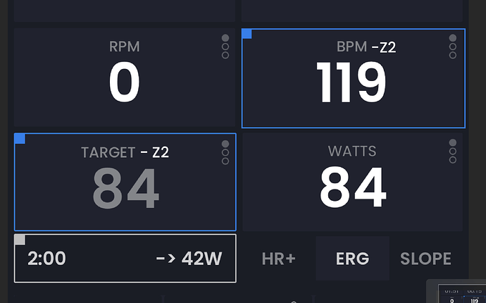
In workout view with Power Zones enabled, target power tile has a zone color frame. I was thinking the same logic could be applied to current HR tile? The only difference being current vs target of course.
Oh, I see. The way we currently do it is we show the target zone, and target up coming zone not the actual zone. Now, in ERG they should be the same 95%+ of the time… So you are suggesting not target zone but actual HR zone… Like image below… That might make more sense for HR based but I need to give that more thought. That would be pretty easy but I think in HR mode people eventually might want to see target zone as well… Anyway, as I said we can’t do this now so we have time to think about it, but as I said I like supporting HR based interests.
Yeah it would be nice to implement target zone too eventually, but after all at least current zone is better than none ![]() Your image highlights RPM instead of HR which is one tile to the right, but other than that, yeah that’s what I meant
Your image highlights RPM instead of HR which is one tile to the right, but other than that, yeah that’s what I meant ![]()
Maybe if you shuffled the tiles around and put current power to the left, above target power, and then RPM to the right, above HR - that would allow you to add a HR target tile with a symmetrical design?
Oh, wow is late, yes around the BPM one ![]() Yeah looks a bit strange. That field is changeable to average watts which makes more sense above actual watts. Also long time users get used to fields in specific places and prefer us not moving them around… Anyway we will take some time and think about this maybe it fits in with another change at the right time. I guess if you turn on HR zones it could move HR to the left… so user choice if it moves or not.
Yeah looks a bit strange. That field is changeable to average watts which makes more sense above actual watts. Also long time users get used to fields in specific places and prefer us not moving them around… Anyway we will take some time and think about this maybe it fits in with another change at the right time. I guess if you turn on HR zones it could move HR to the left… so user choice if it moves or not.
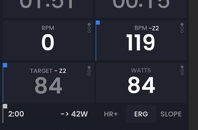
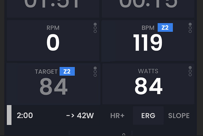
Sorry for spamming you. Just posting one more idea I had here that I really like. Just putting it here for other people to comment on.
No problem, it’s great that you’re looking for feedback. Personally, I don’t like it - I like the UI elements to be easily noticeable at first glance, this is a step backwards for me. But I am a fan of colors, I’d prefer the “Z2” and the number to be displayed in zone color as well (and even the workout block displayed below, but that was already discussed that colors would mess with HR overlay). Actually, if you colored the zone indicator and the number, perhaps the frame wouldn’t be needed anymore?


