On my most recent ride there was an update to the UI (OSX desktop app), whereby the metrics and graph are no longer one on top of the other and are instead side-by-side.
This results in a lot of dead space on monitor, and the only way to force it back to how it was is to resize the window in a more portrait ratio (which on a laptop just makes the window too small).
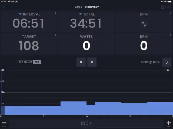
This is the older layout (note this isn’t my screenshot I just stole it of a google search. The numbers are never this big in my app!).
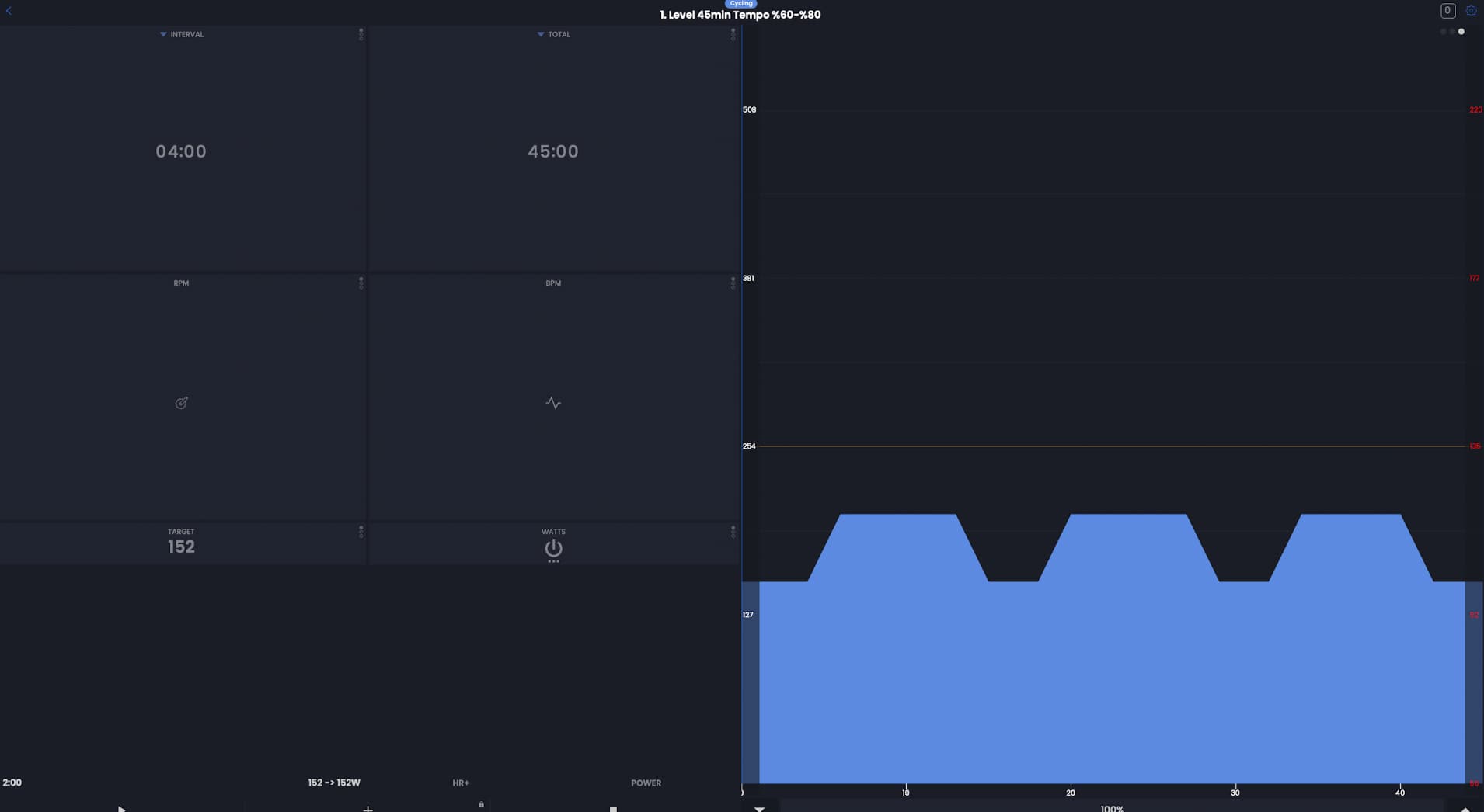
And this is the new layout which feels like it makes the small text even harder to read!:
Oh strange, yes I see that. I think my developer was fixing another issue and it caused this. I just opened on my m-series mac and see the same. I am not sure how quickly we can get this fixed but it should not take too much effort so hopefully in January.
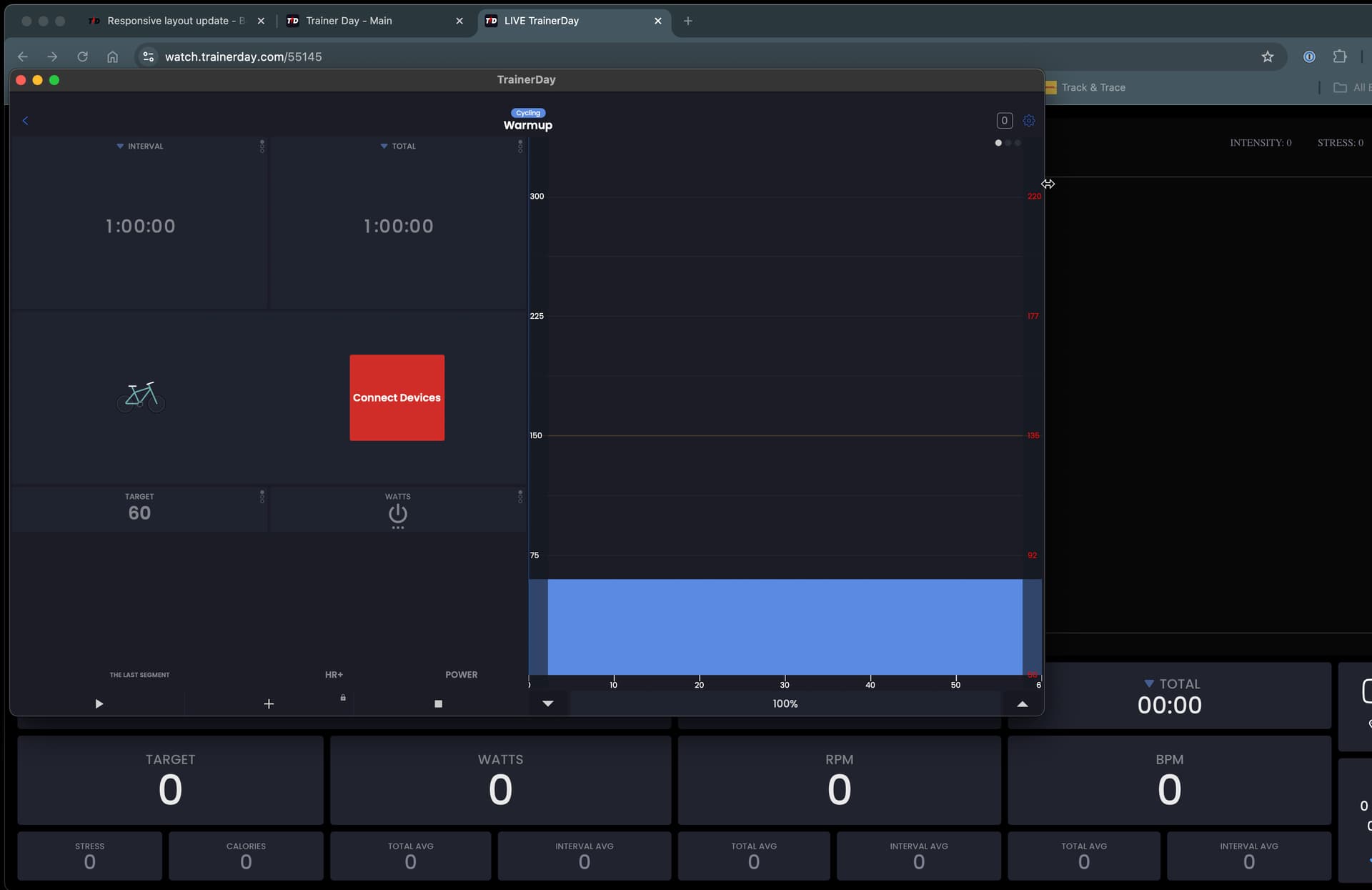
My old eyes suck too!!! We will see what we can do. You can also use our broadcast feature and open it up on a web page. Just turn it on in settings in the app and open your personal URL provided on the website and in the app.
See the app in front of the broadcast page. The broadcast page has much bigger numbers.
Next in a week or two. Actually depending on the shape you put it on m-series it can look ok, but overall we will improve the responsiveness and how it looks on bigger screens.