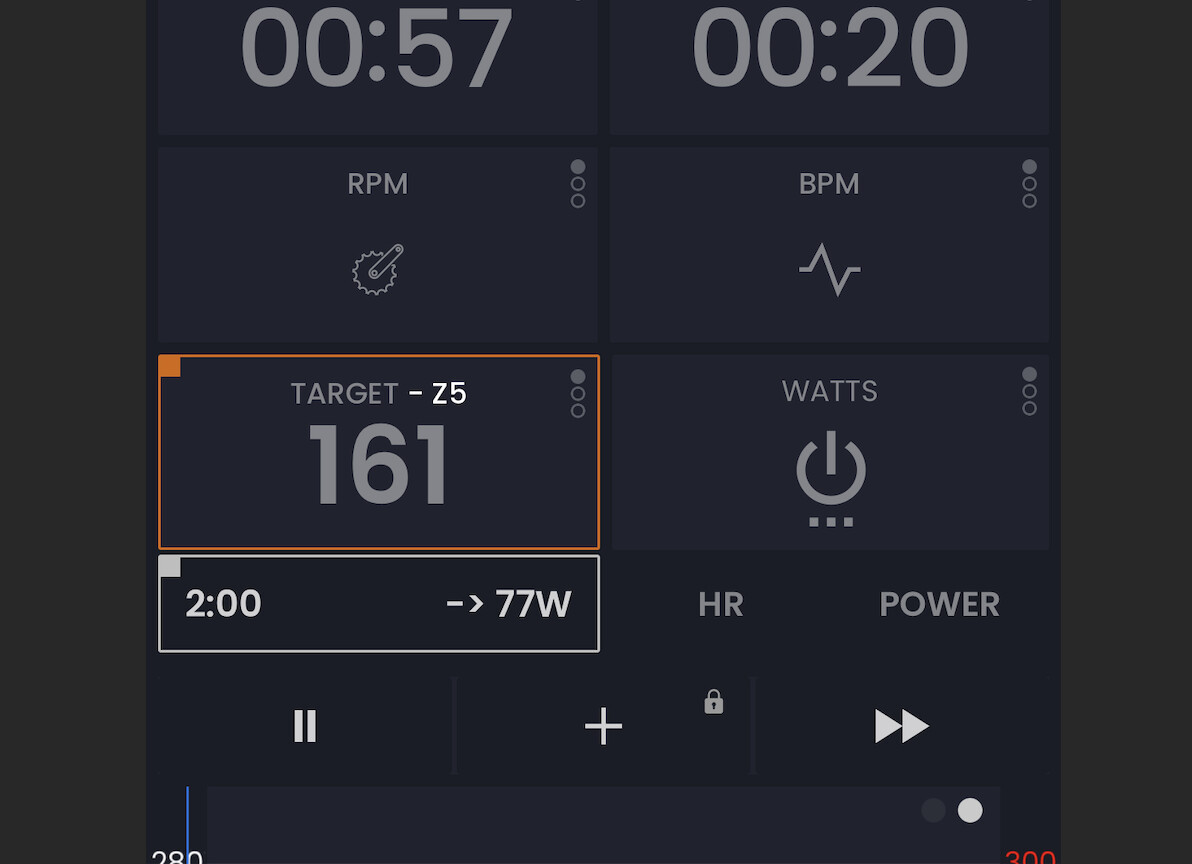
I agree with you. I would like to see something like that in the app trainer too. Why must be show it all in black and blue… Just only different colours with live and light help to effort.
The app works good but why it has to be so boring… Only black and blue??? and a line for power in white…¿? Design it’s important too… Many times I think the view when I use my garmin edge 830 looks better than the appl… Why isn’t possible add and customize more data that the app shows now?..
I think it would be good works in the possibilities to customize the data in the app… And show it with more live and colour…
1 Like
That’s just your opinion man.  I’ve been using training apps for years now. Not my first rodeo.
1 Like
That’s all ‘user preference’.
I like it nice and tidy.
2 Likes
I Will like also color on workout
Hello I see the first thought that came to me while using the app has been already brought up ![]() Coming from Zwift, MyWhoosh and intervals.icu I’d really love to have zone-coloured blocks during workout instead of the all-blue. @Alex you mentioned it could mess with the HR overlay, so perhaps you could at least add an option to colour the current watts or target number at least? Chart would stay the same but the target/current watts number would show which zone we’re currently at.
Coming from Zwift, MyWhoosh and intervals.icu I’d really love to have zone-coloured blocks during workout instead of the all-blue. @Alex you mentioned it could mess with the HR overlay, so perhaps you could at least add an option to colour the current watts or target number at least? Chart would stay the same but the target/current watts number would show which zone we’re currently at.
2 Likes
Ohh, I did, on my iPhone. Then I installed the app on my M1 Mac and it turns out that the settings do not sync ![]() Turned it on again and it seems to work fine, thanks!
Turned it on again and it seems to work fine, thanks!
1 Like
Estaría genial que en lugar de la orilla del cuadrado cambie de color, que todo el cuadro cambie, cuándo llegues a la zona según pedaleas
1 Like
Oh you mean some indicator that you are on target. Hmmm, I will have to think about how we could do that. Interesting idea.
1 Like
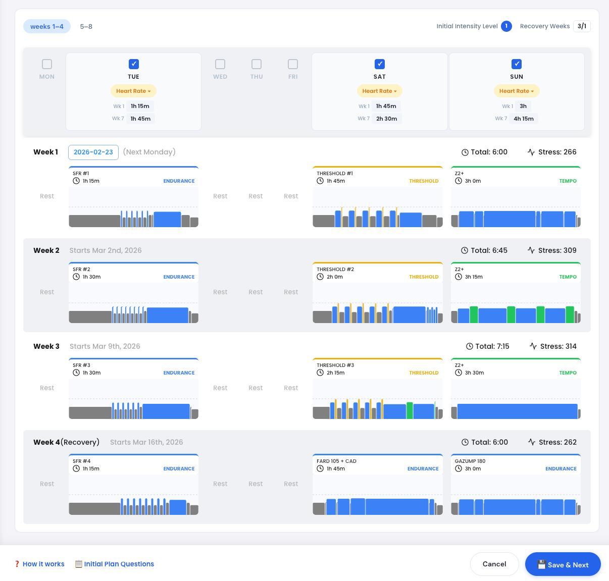
I’m resurfacing this old conversation. In indoor ERG mode, I really struggle with the concept of zones. 75% versus 76% is not a different zone. Meaning the training benefit is exactly the same. When you’re outdoors and doing, let’s say, a range, then zones make a bit more sense. or heart rate training. But this is my personal struggle, not necessarily everyone else’s. I’m working on a new Coach Jack and we’ve already had colors for heart rate and now I have a new design and it looks so beautiful with colors. But I only have it for heart rate at the moment. I was thinking about doing outdoor zones also and doing the same thing.
I tend to be good at confusing people at times. So logically seeing blue bars, indoor ERG makes sense to me and colors outdoors or with zones. Obviously, 60% is different than 73% and calling that a zone difference, I’m fine with.
I guess I’m just airing my struggle here and seeing if somebody can convince me to just start using colors. I know I could make it an option. Use colors or not. Maybe that’s the best solution. I just don’t know. See below what my new design of Coach Jack HR workouts look like. And the problem, 10 of you could tell me, oh my god, switch to colors. But that doesn’t necessarily represent the 10,000 users we have using our app.
Anyway, I’m just, as I said, mentioning this to see if something clicks.
I don’t think this is about exact numbers… At least for me - this is a nice visual representation of the workout, which I am used to see colored on other platforms - so my brain can quickly and automatically judge how much green, yellow and red is there - it really gives a quick feedback how hard workout might be.
I know that you don’t like zone colors - but many people do, so it should be really an option in settings, could be off by default ![]()
Edit: P.S. - Looking forward to new, colorful design!!!
1 Like
I also say have it as an option.
1 Like
I agree, having it optional is perfectly fine…
Ciao,
Erik Il Rosso
1 Like
And are you more of a blue bar guy or would you like to see colors?
In the workout, I am used to seeing blue bars. I don’t think colours would affect the outcome of the workout.
In the analysis (using intervals), I am used to seeing coloured bars. I don’t think a lack of colour would affect the analysis I want to do.
I mentioned previously that my HR armband changes colour depending on HR zone
and, for those that really want colour, a smart light can be linked to a trainer / hrm / zwift to illuminate the pain cave in a colour according to zones
Yes, that’s what I’m thinking too. I’m not thinking about changing the workout player, only the website. Making the default of the website colored, especially for people that use Zwift or use MyWhoosh or use whatever.
3 Likes
I noticed the changes to the site, my calendar, workouts, etc. Colors. Can’t say I like the changes, but it might just be something I’ll have to sit with for a bit and get used to it. I don’t use other platforms like Zwift so it’s new to me. It’s “prettier” but also “information overload” perhaps. Blue bars was simple and how tall or short each bar was, is enough for me to recognize the amount of effort.
One thing I’d like to add, on the MY Calendar page, there is now only a green check mark to let you know you did the workout. Maybe a Red X under the ones you didn’t complete would be a nice visual too. To keep it simple that would be enough. If you wanted to get ambitious, maybe a Yellow !, or something for a workout you did but didn’t complete. For example, I had a 90 min HR+ workout on the calendar, but only did 30 minutes of it. Right now that shows a Green Check.
I have no problem adding a blue, adding back an option to have all blue. I was waiting to see if anybody would complain. I think blue is a better structure. Especially for indoor stuff, I really don’t like the zones. There’s no difference between 75% and 76% from a zone perspective. So, if it does bother you, I’m happy to make it a user option that we show the blue ones by default. I just wanted to see who complained.
I should say, adding this switch to user profile is super easy. I should say, I do actually love the colors, just from how beautiful it is. I just don’t like what it represents. And I think in terms of talking in zones, it’s fine.
“Hey, I’m going to do a zone two workout today.”
“Hey, I’m going to do a threshold workout today.”
Regarding the red marks or the yellow marks, I don’t know. I have to think more on that one. Humans are so different in how they react to negative reinforcement. I would create that as a second feature request if you really like it.