I’m asking if will be posssible to appy differents colors depending about the FTP% zones, while we are training with watts. Could be perfect a different colour for every watt zone in a segments training.
I am not 100% sure what you mean. You just mean zone colors like this?

I assume you mean the standard coggan zones? What I don’t understand is what does “training with watts” mean? Or do you just mean not HR?
I don’t personally like these colored zones but I know at least one other person requested this. If enough people wanted it I guess it could be a setting or maybe there is another way to accomplish this, like showing a color some place else on the screen?
Sorry for my english, I’m from Spain. Thanks for yor answer. Yes I want to say Power zones (Coggan zones). I understan that’s really difficult adapt the graphic line evolution (Power for exemple) with a different colour of zone target, but may be a different tonality for any workout segment… with the purpose to have a intuitive vision about the change of segment… It was just an idea.
Another idea, could be put a field on training app just like the garmin field with a target objective, something like this

As you can see, in green the target zone, for me this it’s more easy to keep in the target range.
I’m very happy for your answer. It has been a surprise. Thanks a lot for your Job. I try rouvy, bkool, etc even Golden Cheetah… to train with workouts, but I’m very happy to find your web. It’s just what I needed. Simple and clear, easy. I create my workouts or planning or simple get one of the ones already done, and then I export to my garmin edge 830.
And I’ve got to say again, that is just what I needed.
Thanks a lot again
Ok you are welcome for our site. So you are saying colors in our training app (or field in Garmin) I assume you are not using ERG mode. If so now I understand.
So are you saying something like this?
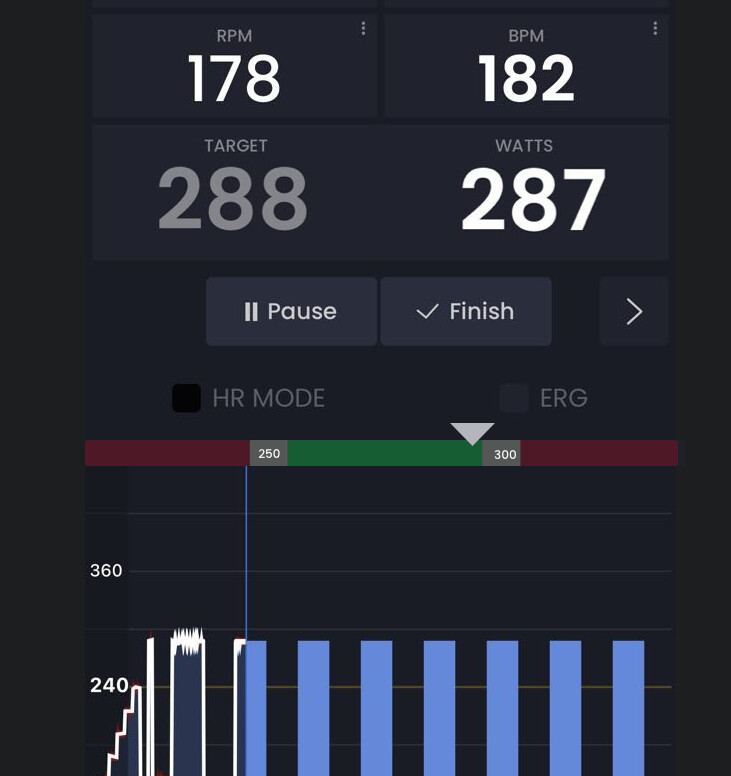
I actually like this idea as soon as someone switches off ERG mode (or it is disabled like in this example) we could show this. This would be good for dumb trainers, rollers, or spin bikes for example. I am thinking maybe it should not be turned on for slope mode with slope targets for example. Need to think about that.
1 Like
Yes, exactly. That’s what I meant. I have an elite direct xr trainer, and I usually use it in resistance mode, with erg mode disabled. Since when you do intervals with a very large difference in watts, the erg mode makes very abrupt changes and is very difficult to control.
I use the / 3s power target. It would be a great option to have it in the app and be able to use it on a larger screen than the garmin edge 830.
Thank you very much again
Oh I love it!!! Smart trainer in resistance mode. I have Neo but mostly use my spin bike (it’s inside Neo is outside) and I realize I like resistance mode a lot (the only mode the spin bike has). So I would like this feature too, but I am not serious about training so I can use it the way it is, but I fully see why you want it. Also very short duration (< 10seconds) does not work very well in ERG either.
Ok yes I will plan on adding this. I like it 
1 Like
I’ve been using for a long time a classic trainer, and I had the chance to prove a direct transmission (smart trainer) trainer… And I give the chance… More stability… powermeter integrated with elite direto xr… And I don’t need to play or train like a videogame. I put my headphones… my music… And a workout… when the weather is not good to go out… And that’s all I need. And then I found your web and all the info… all the workouts… and now the trainer Jack… That’s amazing
Thanks Alex! And I’m pleased to meet you!
Best regards from Mallorca! 
Hi Alex,
Fairly new user to to Trainerday and loving it.
I use it in 2 setups - one with my Kickr in ERG mode, but I also have a spin bike with Garmin Rally power pedals attached which I find great for Zone 2/3 rides.
For the wattage targets, it would be really amazing if the whole “watts” field background could be coloured to show when you are within range.
GREEN - in range
ORANGE - just below range - more power needed
RED - too low or too high
When trying to hold power without ERG, it really would make it a lot easier to see - especially when under pressure and the heart rate is pumping!
I use on my iPad in split view with Netflix and the little bar on there presently is ok, but this tweak would just make it much easier to interpret when under pressure!
Keep up the fantastic work!
Our current implementation is not good (too confusing) but did you turn on our zones feature? Let me review your idea in detail. We are going to improve this.
Thanks a lot Alex - appreciate the response.
Just looked up about the zones feature.
The thing about that is - I don’t need to know what zone I’m currently in, as I’ve preselected a workout which I just need to follow if that makes sense - telling me what zone I am working in isn’t overly useful during the live workout (it could maybe be shown a bit more succinctly by simply colouring the interval blocks at the bottom).
The idea of having the whole watts field go green/amber/orange is for me as a non-ERG user to instantly see if I’m on track. The bigger and bolder this is - the better.
Thanks again for being so active on all these requests - its really great to see such a dynamic approach to making the program as good as it can be.
Another thought just occurred to me - non-ERG users have very different visual requirements from someone on an ERG workout.
It would be very good if there were in fact 2 separate layouts, so that the different priorities for each can be laid out to their maximum potential, rather than having to cover all bases in one static layout.
Kind of like custom pages on my Garmin, where I’ve an indoor layout and an outdoor layout where I have different fields and sizes depending on what is important to that discipline.
Yep I understand 100% and as both ERG and non-erg user I fully get what you are saying. We have guys with smart trainers here that use slope mode mostly. They are actually in the same position. I like this thinking. Will take me a little time to think and internalize this.
All blue is boring… The app is awesome, is the best out there but you loose interest.
And the possibility to change layouts is a fantastic idea hope you could do it
1 Like
The biggest problem I have with colors is it makes you think there is a significant difference between the colors. This is the wrong perspective. It’s like if a red light and a green light at a stop both meant go… It would be confusing… It would be much better to have a blinking yellow light. We support that people like to think in terms of zones, and obviously there is a difference between recovery and vo2max. But there is no difference between 75 and 76% and they are two different colors.
Since Zwift does it and they are the biggest, it’s probably something most people want, I just really struggle with this. It also works better when you don’t have power and hr overlaying the chart. I realize it could be a personal setting but even when HR line overlaps red you can no longer see your HR line…
Sorry just explaining my thinking, partially to get people providing ideas outside my way of thinking.
So doing what seems like a decent amount of work for a sub-optimal solution feels less than ideal. Not to mention we are really focused on bringing people very simple affordable training. But I am always listening even if I am “arguing” my point. It’s not about me, it’s really about the rest of you.
Colors can blend into each other. This is how XERT does this.
Maybe this is an idea of how to handle your point.
Yes, Armando gets it. I would say on the other end TrainerRoad also gets it It’s funny because with or without the colors I see the same thing meaning you are already showing the intensity with the height of the watts.
I think the previous argument was more about the boringness as compared to the usefulness… Also I would say our goals are closer to TrainerRoads (other than the pricing concept and max TSS / sweet spot focus…) but I think TrainerRoad is the best at offering simple interval training focus. I think Xert is the worst at offering simple training. Not saying TrainerRoad is better than Xert from a training perspective, I am just saying TR is the best at simple.
I want to be as simple as possible but offer more flexibility than TR when possible without making things more confusing. We are not the best at this NOW but this is where we are going.
So from my perspective colors offer another point of possible confusion without a ton of value or increased flexibility. Why is this green, why is this blue, can I change my zones… What is this zone range editor for… We show zones now as it is a common way of looking at things…
Anyway, thanks for the suggestion. I love to see what others are doing. I have not used Xert in a long time. I know recently they just made some big changes.
I would LOVE to see more companies colorize workout power profiles. I think Zwift does the best job at it. It’s a million times easier and faster to immediately see how hard each interval is, without having to interpret graph lines.

Intervals is close, but I don’t like how they layer the colors. An interval can’t be Z1+Z2+Z3+Z4 all the same time. It’s either Z4/red or it’s not.

de gustibus non est disputandum
@jmvcolorado You already show the report in ZWIFT, then the report from intervals.icu. TD has no analysis. Rather, there is a discussion about coloring the workout plan, which the intervals.icu you mentioned earlier does very well.

I use it and in fact a glance is enough to quickly assess what awaits me. But what for? After all, the training has to be done anyway. 
1 Like
Apologies for the confusion. Yes, I was referring to the graphical representation of the workout on the TD website (either your calendar, plan, or workout browser); rather than it being solid blue blocks for everything. Personally I find the color coded blocks to be an easy at-a-glance overview of a workout.
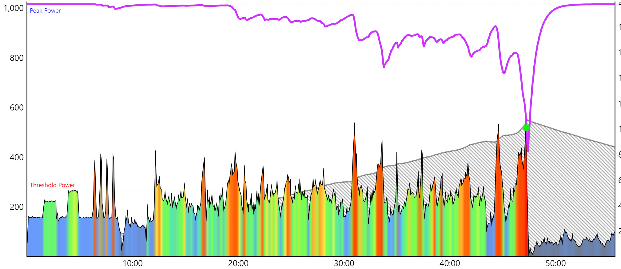
I posted a screenshot of Zwift (post-workout) as an example because it’s think they colorize power the best way I’ve seen.
Personally I don’t use Intervals.icu for calendar/planning, so I don’t look at my upcoming workouts on there. I prefer to schedule/browse/create/plan workouts directly on TD. 
If you have a designated FTP, then when you build a workout or create a plan, you have a line that determines your FTP. If your bloks are halfway through, a bottle of water will suffice, if they are 3/4 of the way up, add two bananas, if they are close to that line, order an ambulance in two hours. It was a joke of course.
In fact, in these blue blocks and this line, you can see how hard the training will be. It’s a matter of habit, colors are good for children.