I have ended up using my old touch-screen laptop, since my old phone has connection issues. (I am not sure if the phone side or the app side changed more since it worked, but the computer just works fine.) So two things came up.
One is that on the computer screen there is probably more than enough place to have large enough buttons for the performance adjustment, and the start/stop buttons. Maybe the whole ribbon could be bigger. At the moment, they are really tiny, and I would need these buttons (esp. the performance ones) when finding a button with my finger is not necessary very easy. Also: maybe there is enough place for a ±5% in addition to the ±1% too. (I do find it very useful that it is not only ±5% as on the phone app.)
Also when you are looking at the text description of workouts everything appears to be scaled down by a time scale unit. I mean minutes appear as seconds: both the segments and the segment aggregation, and hence a 1h30 trainings appear as 2min trainings.
(This is not Windows-specific, but the description is shown as, say, 12min @ Z2, but an actual wattage (in addition) might be informative.)
So we have the ability to expand and show 3 rows of data and some people watch videos, so all this factors into button sizes. For sure I will review and can assume small changes could be made at the minimum. Would look at this when doing other changes.
For now you have 2 or 3 other options. External keyboard (I guess not if it is tablet style mounted on bike). Also our mobile app can control the desktop. You could even likely have some small bluetooth programmable keys that mount. But regardless I will look at this to see what is possible on sizing.
Yes it should show power on next interval, let me review that.
To tell the truth, I am just back on the bike after some time (hence the new findings that are changes compared to older versions, and hence the tablet is a change etc.), so I am not quite at the state where one has all-out segments: that often need adjustments for me based on the state I am at on the day. So while I hope I will get there again, I am not very time constrained for the moment.
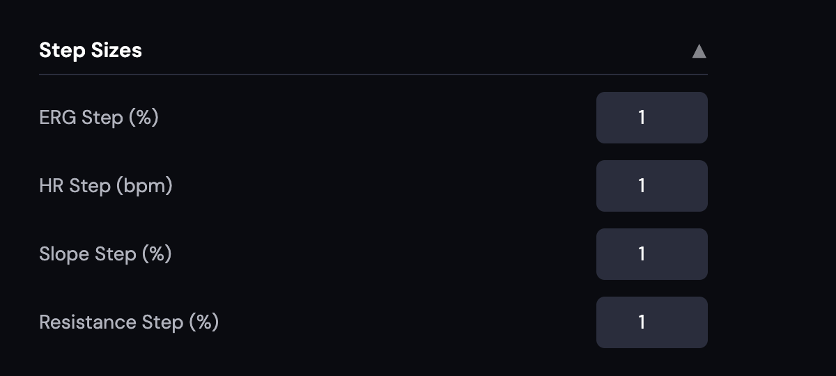
At the moment the Windows UI offers ±1%, which I find very useful. The phone UI offers ±5%, which is also useful but differently. I was kind of hoping that there was enough surface for both on the computer.
The player does show wattage for the next segment (btw, I might also hope that there is enough space for the next handful of segments… esp. if the ribbon is made wider… and once I am at it: maybe RPM for them too? (that I cannot infer even from the bar chart)) Only the text description that shows only Z2 but not wattage. So it is not that important, but does not appear very complex.
I understand that an app cannot be custom made to one user, but I thought it might be useful to share my suggestions if they make sense. Please take them only as such.
Super happy to hear feedback/ideas/suggestions. See settings below, we should change the default to 5% in the desktop like the mobile but both are adjustable. Let me think on that “handful of segments” I like this idea. My default is thinking everyone wants everything now or thinks it should be they way they want it Thanks for clarifying.
 or thinks it should be they way they want it