- After pull-down-refreshing the workouts, you are back at the first page (plan). Very frustrating when trying to find a recovery (4th page).
- Having to pull down on the title and only the title to get new workouts is poor UX, normally you are able to pass gestures to the parent container to fix this. Feels like something that is just 1 prompt away.
- Small UI issue, but on the latest ios, the app does not use safe area insets so small parts of the app are partially hidden behind the rounded corners of the device. Nothing blocking but it looks a bit bad.
- Please try to not cause setting resets with app updates. Like the auto-start settings was reset.
- I don’t remember the exact repro steps but I could not find my favourites on the app after the update, and I had to go on the website to click some specific buttons to get my favs back in the app?
Sorry about that. Great feedback. We’ll get this fixed ASAP.
Regarding the favorites disappearing, there’s some weird issue that I’ve seen it periodically, but can’t reproduce it. I’m trying to put extra safety steps in there to make sure it doesn’t happen.
I should say safe area inserts sound like nice idea ![]() But my god this is not standardized at all. Google says they are depreciated… They are very unpredictable from our perspective and what you are seeing is probably on a device setup that does not match any of the devices we use for testing on as we do watch this closely for all device possibilities. But you fix one and it seems to cause issues on another. Add insert one device soon, huge gap on another. It’s all us I know… “no excuses” and sounds like you know what you are doing but this is far more difficult than it should be from my perspective….
But my god this is not standardized at all. Google says they are depreciated… They are very unpredictable from our perspective and what you are seeing is probably on a device setup that does not match any of the devices we use for testing on as we do watch this closely for all device possibilities. But you fix one and it seems to cause issues on another. Add insert one device soon, huge gap on another. It’s all us I know… “no excuses” and sounds like you know what you are doing but this is far more difficult than it should be from my perspective….
Here is what all the devices we use look like. Pixels and modern iPhones mostly, a bit of samsung phone testing. Some tablet tests.
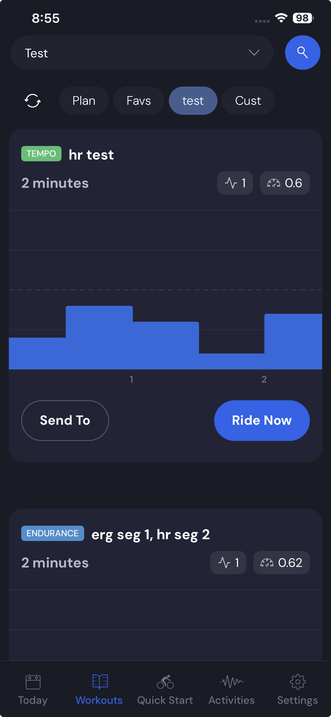
So we went to review your suggestions here. You’re talking about pull down to refreshing workouts, but we don’t have pull down to refreshing workouts except on the Today tab. I assume you mean that. And you can pull down on the whole top of the page just not on the chart itself.
Now I see what you mean. on iPhone 17 emulator.
Here is what safe area would look like but that’s obviously not great.
So we built a custom safe area that just makes it narrower. I think this is better than that huge waste of space. As you know things are frequently a compromise.
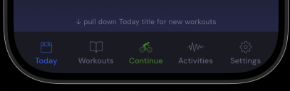
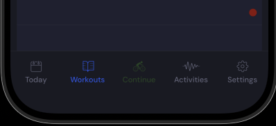
Regarding the tab change, I assume you mean on the today tab. I fixed this.
And pull down works on the whole top section just not the carousel. It seems pulling down on carousel is not easy to do.
Next build you will see these changes and yes we now have automation testing to try to make sure settings are not lost between upgrades. We have many updates and this was one time thing but I know it sucks.
@Alex thank you for all the answers and fixes.
I understand the safe area insets are a trade-off.
Current version looks a lot better on my iphone 17 pro.
I don’t know if your app is React Native / Expo app but I recently tried converting to Expo’s new Native Tabs and my LLM pretty much one-shotted the conversion. Maybe worth a try in the future but like I said, your latest update looks fine!
Tab change: I indeed meant on the ‘today’ page and this is indeed fixed.
Regarding the pull down:
Personally I would just get rid of the pull down feature and replace it with a refresh button. Then I can just spam the refresh button until I get a workout that I like.
Since you already have to put “pull down on today Title for new workouts” at the bottom I guess the pull down was already hard to find.
Yeah, I did lots of research thinking about switching to Expo. Claude seemed to think that staying native was better for us. Better Bluetooth library support or something, I don’t remember.., a few things. It’s incredible what you can one-shot these days. The problem is we have people with very small phones. We used to have a refresh button, but we got rid of it trying to fit in the space, I plan to try to add more on bigger phones. We also have a button that shows up for remote controlling our desktop on Today, which makes fitting on small phones tricky.
No one seemed to complain when the refresh button went away. So you’re the first one saying you would like it. I fully understand your perspective/reasoning, and so if I see a way to sneak it in, I will consider it.
1 Like