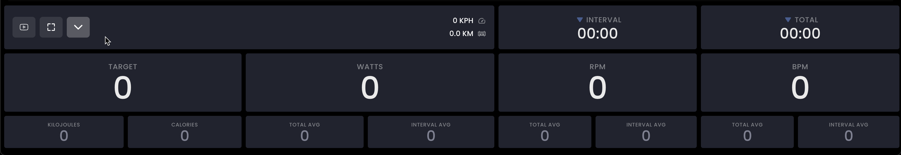
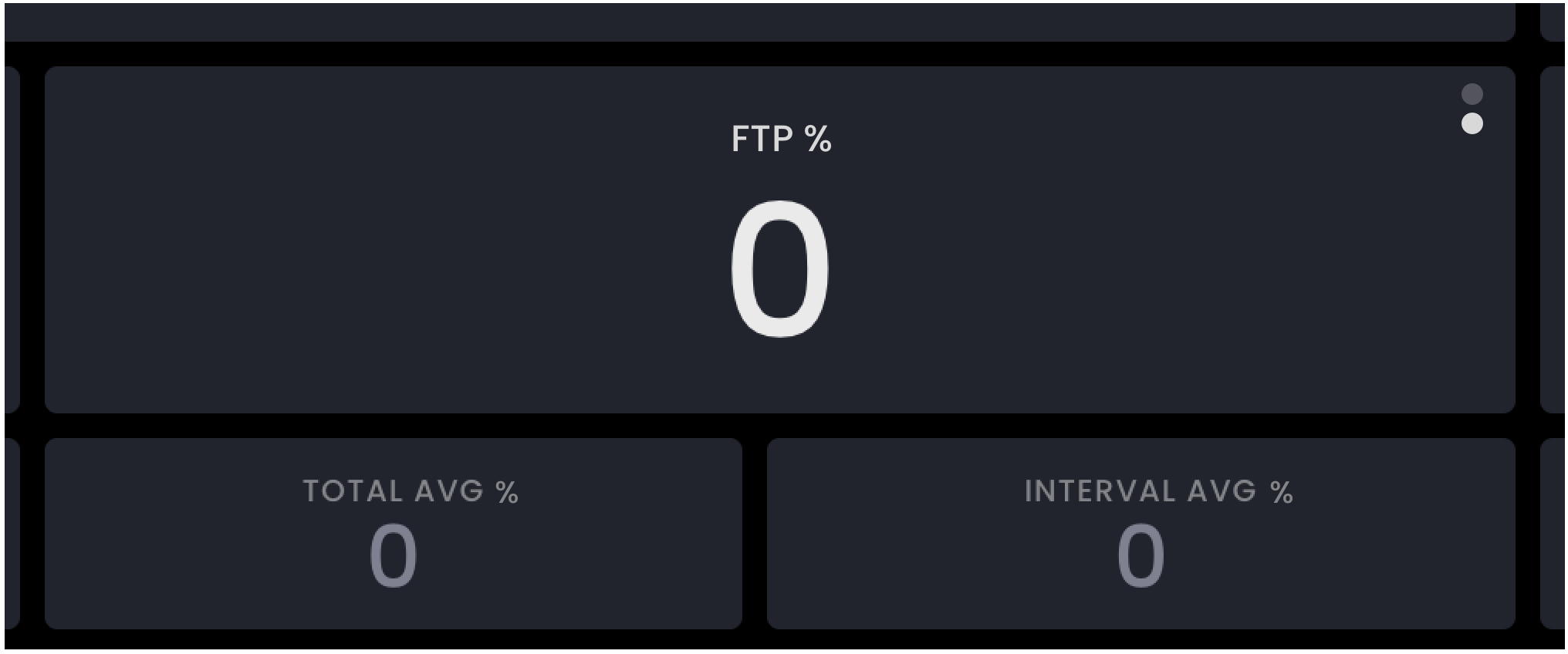
What do you think about a 3rd box on the row where target and current Watts/FTP% info lives (on phone live activity display) that showed “average watts/ftp% this interval”
I think this would help me finesse my zone 2 power gains via eg knowing when I needed to push a bit more (if I could do so and stay within z2), based on how a given interval was going, on average.
(Plus, Maybe an option to toggle this box on/off in settings, if there’s a concern that some will miss the more minimalist 2-box on row display?)
That said, I love the phone and web live dashboards so much.
Alternatively, a single box with left and right “sub-numbers” could be a design option.
Big number could toggle between current watts and current FTP% for current interval. Bottom left small number is target watts or FTP% for interval, bottom right is avg watts or FTP% for current interval.
i.e. mimicking the design already in place with eg cadence upper/lower bounds on some TD interfaces.
Oh no, the odds of us adding more to the phone app are small. There are way too many sizes and layouts, it’s much too complicated to add anything and my developers doing phone work have enough work they will be busy for a long time. We have to do easy or very critical stuff there. This live view is much easier to change but you have to obviously view it on a bigger screen.