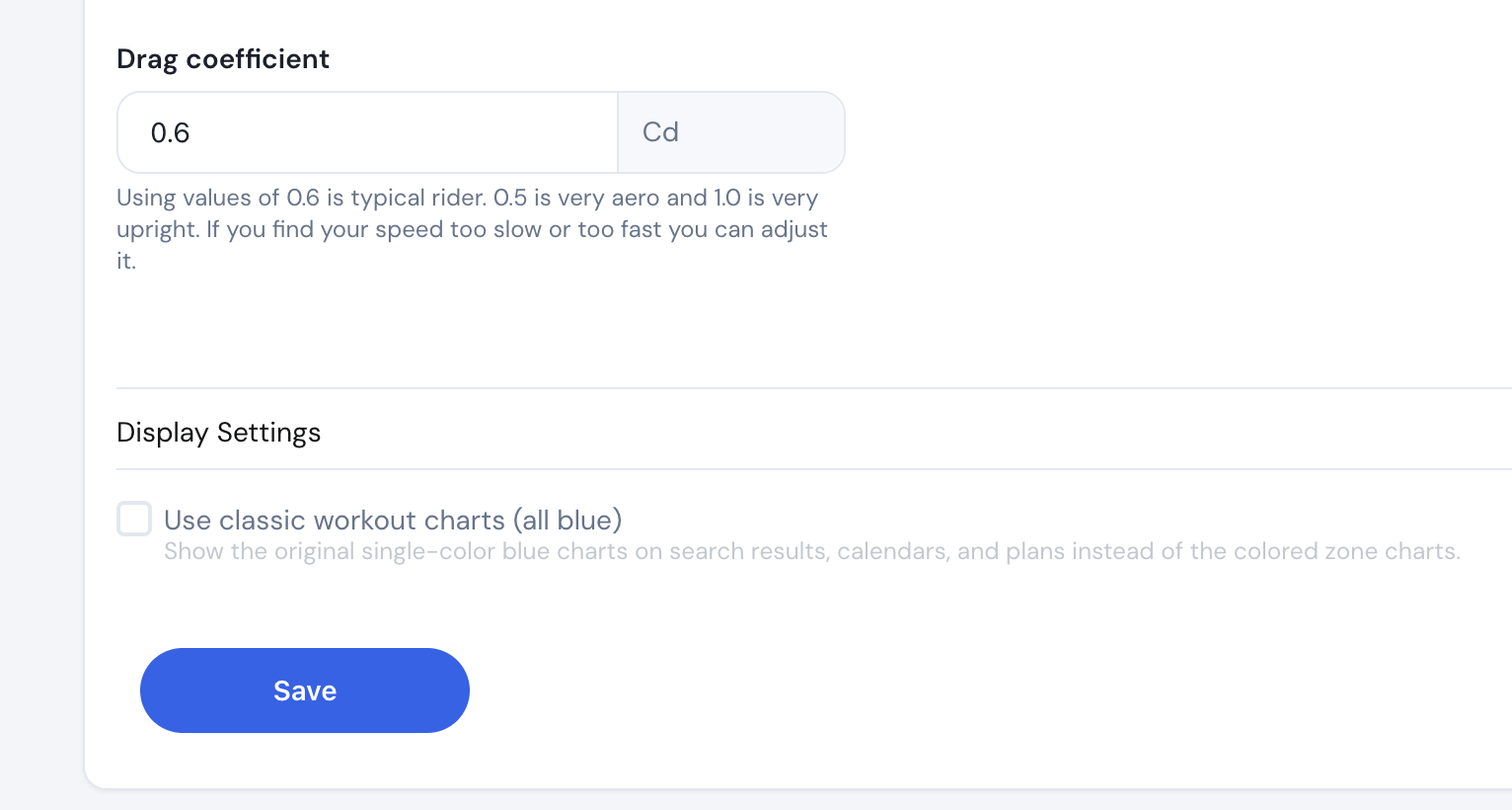
It is visually appealing. I’m not complaining. If I was new to the site, I wouldn’t know any different. I would just say I’m used to the blue and for me, it’s easy to mentally process it. But for those who use other apps and platforms it likely works well. I mean on the road I like the color-coded zones on my Wahoo head unit for when I’m doing workouts.
And for attracting new users it would probably help draw them in visually.
You could make the color default and the revert to blue a user option.